Color Matching For Your Wallpaper Murals
Do you really like an image you see, but would love it more in a different color? No worries! We may be able to match it to the paint color(s) or Pantone® color(s) of your choice.
Color Matching At Murals Your Way
- Any color match will be the best and closest representation within in the CMYK, four-process color gamut (i.e. range) of our printers. A 100% perfect match to Pantone solid inks or paint swatches may not be possible due to differences in materials and printer ranges.
- Printed proofs are required with color matches and will be provided on the material you select for your final mural.
- Color matching is done by our talented Design Team. There is a fee for color matching. Fees are based on the number of printed proofs necessary, as well as the graphic and production time required to achieve a favorable color match.
- Helpful tip: It is generally easier and more affordable to match paint colors to the mural rather than adjusting the mural colors to match the existing paint.
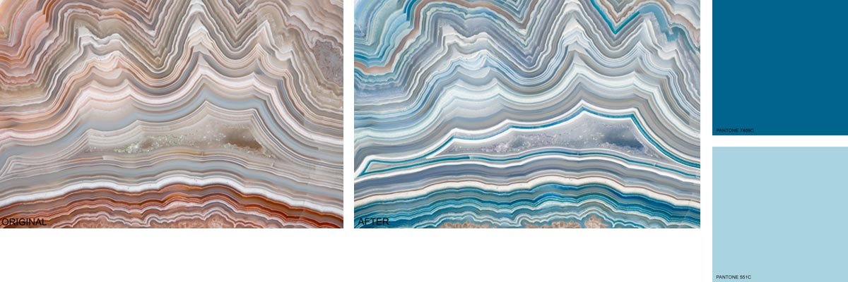
For one customer, we changed The Polished Cut Of Agate Wall Mural from the original brown tones to blue by matching the colors to Pantone blues provided by the customer.

RGB, CMYK, and Pantone Matching System (PMS)
RGB stands for Red, Green, and Blue. These colors are used in monitors, digital cameras, and scanners as well as any digital or web artwork. CMYK stands for Cyan, Magenta, Yellow, and Black. This refers to ink colors used in four-color process printing. An RGB file printed on a large format printer will be converted to CMYK.
The Pantone Color Matching System is a standardized color reproduction system. There is a limited number of Pantone colors that can be reproduced with CMYK ink. Just like CMYK is a mix of four inks, each Pantone solid ink, also known as a spot color, is a precise mix of 18 basic colors. Therefore many Pantone colors fall outside of the CMYK gamut. To print the Pantone spot colors that are outside of the CMYK gamut, an extra printing plate would be needed for each of the spot colors. While this is common in offset printing, it is extremely expensive for short print runs. For small or single print quantities, digital printing is the most feasible method. The best digital printing solution is to compare Pantone spot colors with CMYK ink colors. This can be done by using a solid to process guide set which simulates how a Pantone spot color will print with CMYK ink.
RGB is best suited for digital works, CMYK for mixed color prints such as photographs or printed artwork, and Pantone spot colors work best when matching a single color.
Delta-E
A Delta-E is used tell how far off a print or proof is from the original color. It is notated by a single number that represents the difference between the original color and the output color. A dE 1.0 is the smallest difference the human eye can see. A dE between 1.0 and 2.0 is considered to be visible by close observation. A dE between 2.0 and 10.0 is considered to be visible at a glance. At Murals Your Way we aim to be within 3.0 dE of the original color.
Natural Light
Our color matches are all compared to d50 lighting, as in natural sunlight. In natural light, if the color swatch and the printed material are within 3.0 dE of each other we consider this to be a match.
Color Books
We have the following color books:
Pantone: CMYK Coated & Uncoated, Color Bridge Coated & Uncoated, Solid Coated & Uncoated Sherwin Williams: Color Options, Energetic Brights, Essentials, Fundamentally Neutral Benjamin Moore: Affinity, Classics, Preview
*Please Note: not all of the colors within these color books can be matched exactly with four-color process printing (CMYK).
We Are Here To Help
For ideas on which colors may go well with your mural please call us at 888.558.0279 or use our contact us form and ask one of our sales staff for a sample with a color palette. You will need to have your material(s)/fabrics already picked out to ensure closest results.


